Laserfiche Mobile Dashboard:
CASE STUDY
An appplication for accessing and working with documents on-the-go

The internship ended on September 25, 2018 when my team and I presented our designs in front of the professional design team from Laserfiche. To view and our design process and prototypes, please scroll down.
Laserfiche is a privately owned software development company that creates enterprise content management, business process automation, workflow, records management, document imaging and web form software.
Laserfiche wants to further its ability to address the needs of their less technical users (the participant user). Laserfiche wants to engage with these users via their mobile platform. Mobile is an important component of our business model and of their customer’s business models.
Their current mobile experience needs updating, and should look at leveraging our Web landing page Dashboard project. The new Laserfiche Dashboard, will provide users areas of aggregated content based on their specific needs.
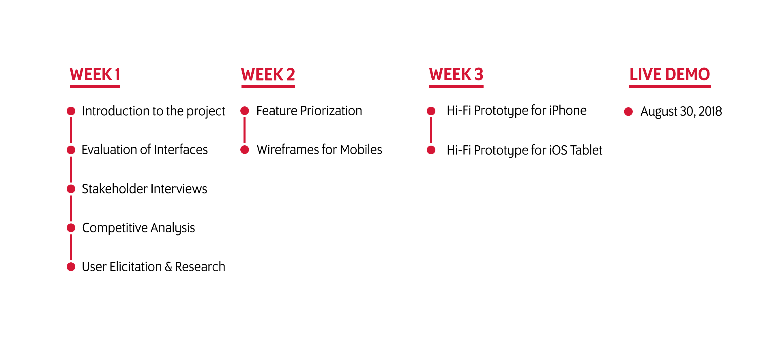
3 weeks
Stakeholder interviews, competitive analysis, visual design, mobile design from sketches to prototypes
Pen, Paper, Marker, Whiteboard, Google Forms, Adobe Xd
My team and I were reached out by the Laserfiche design team to help with designing the interfaces for the iPhone 8 and the iOS tablet. We were given 3 weeks to complete the project and present it at the end of September to the Laserfiche design team.
We sat down with our client, the UX Director and the UX designer of Laserfiche, and conducted a stakeholder interview to procure the requirements of the system and project. Even though the current designs are functional, the client would like to redesign them with a different perspective in hopes to better the interfaces of the application and interactions for the users.
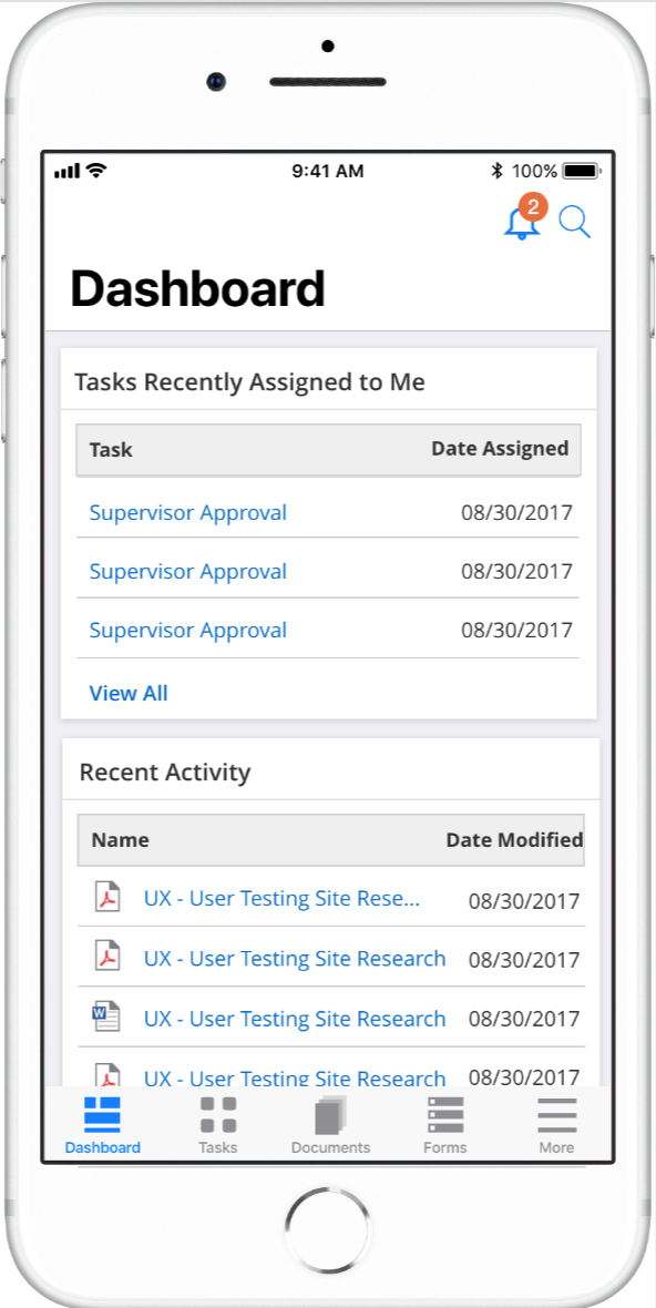
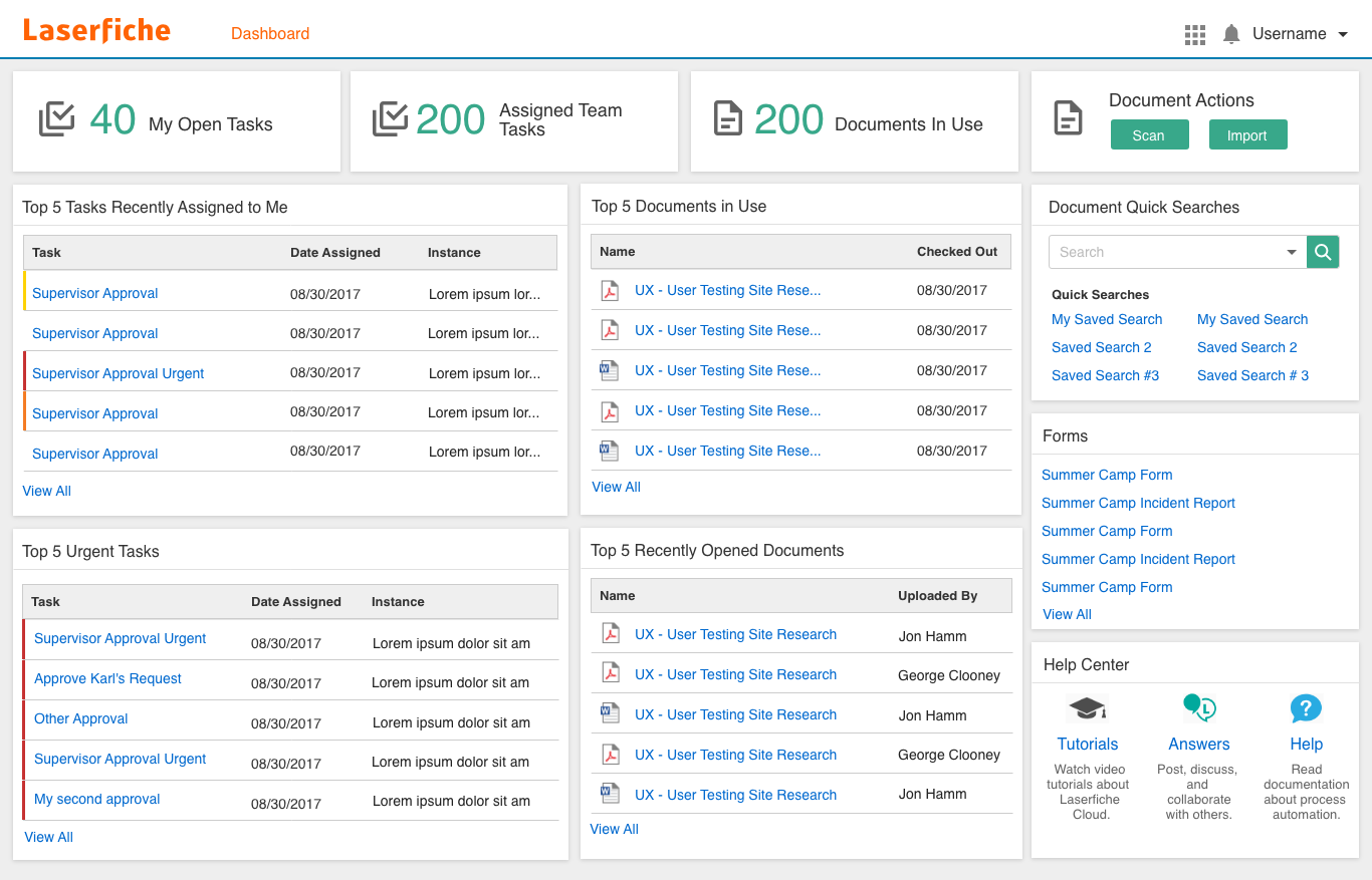
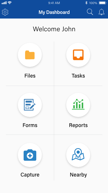
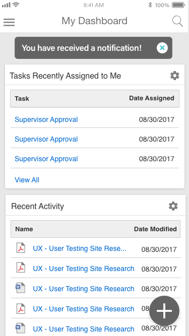
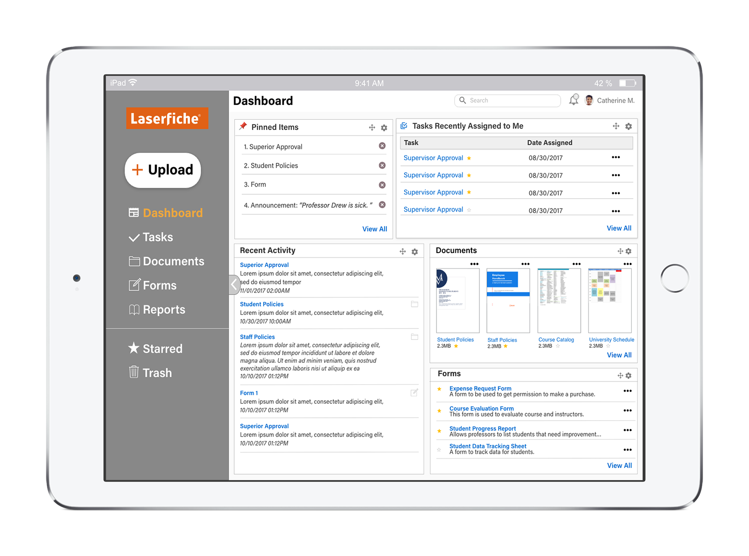
From evaluating the current interfaces of both the iOS mobile platforms, we found that the interfaces were inconsistent with each other. For the iOS tablet version, there was too much information on the screen at the time. Our goal for the tablet was to reduce the page to only the relevant features and information. In contrast, the iPhone dashboard wasted too much space by having only 6 icons. We would like to make the icons into a bottom navigation and display relevant information above the navigation to make use of the available space.
We used Google Drive and Dropbox as inspirations for designing the Laserfiche mobile interface. The reason we chose these two applications is because they're successful management tools that serve many users. Additionally, we love their design for their simplicity and easy navigation.
The two users the client want us to consider were the Document & Task Users and Basic Users. Document & Task Users manage documents, tasks, and access. Whereas, the Basic Users can only make notes on the documents, search, access and store documents.
Considering the type of users and features, we wanted to design the mobile dashboard with UX design concepts, including usability and accessibility. From our user elicitations, we understood that the majority of the users of the Laserfiche service and application tend to be older. They're also professionals in many fields, including government, education, and financial.
The followings are a sample of the questions asked:
We began ideation by creating a mind map for the Laserfiche management tool. This helped us generate new features and solutions for the new design.
We listed out the possible features from the mind map activity. Then, we prioritized those features based on the goals and needs of our users.
We created our wireframes individually and then put our best ideas together into one design.
After we showed our client the design, the client really enjoyed our take on the interface. However, one critique that was said is that the design was very Android influenced, especially with the hamburger bars.
Using our refined wireframes and new ideas, we created high-fidelity mockups in Adobe Xd. I led the design of the iOS Tablet mobile layout and assist on the iPhone mobile design. My vision for the layout is to display relevant content and navigation without overwhelming the users and. After completing the mockups, we created interactive prototypes in Adobe Xd.
The biggest lesson I learned during this project was the importance of understanding the users. Initially, when we designed the lo-fi mockups, we did not have a full understanding of the users, but once we did user elicitations with the client, we got a fuller understanding of the user's characteristics. Another lesson I learned was the importance of the research of the plaform's human interface guidelines. It provided us a better understanding of the features catered to the iOS users.
Click the image to open the iOS tablet protype in a new tab
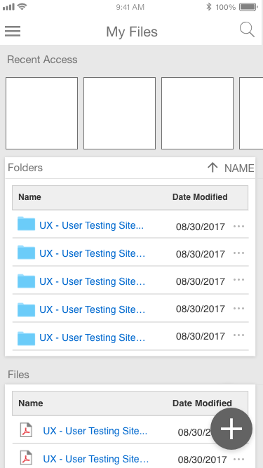
Click the image to open the iPhone protype in a new tab